Spotting the Killer in Knives Out: The Steelbook Cover Clue
When a film like Knives Out arrives—sharp, playful, and fond of misdirection—every creative choice that surrounds it becomes part of the conversation. Posters, trailers, social posts and, for collectors, the steelbook cover for special editions are not neutral marketing afterthoughts: they are another canvas for storytelling. For fans who want to see the movie’s logic applied everywhere, the steelbook cover is a particularly delicious place to look. In this long read I’ll show how close visual reading of that packaging reveals a deliberate, bruise‑small clue that points toward the murderer—and, more importantly, teach you a reproducible method to spot similar hidden signals in other films and editions.
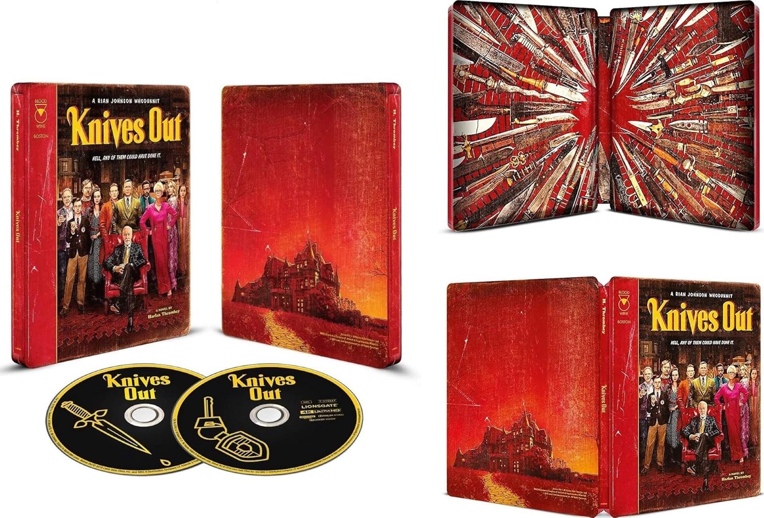
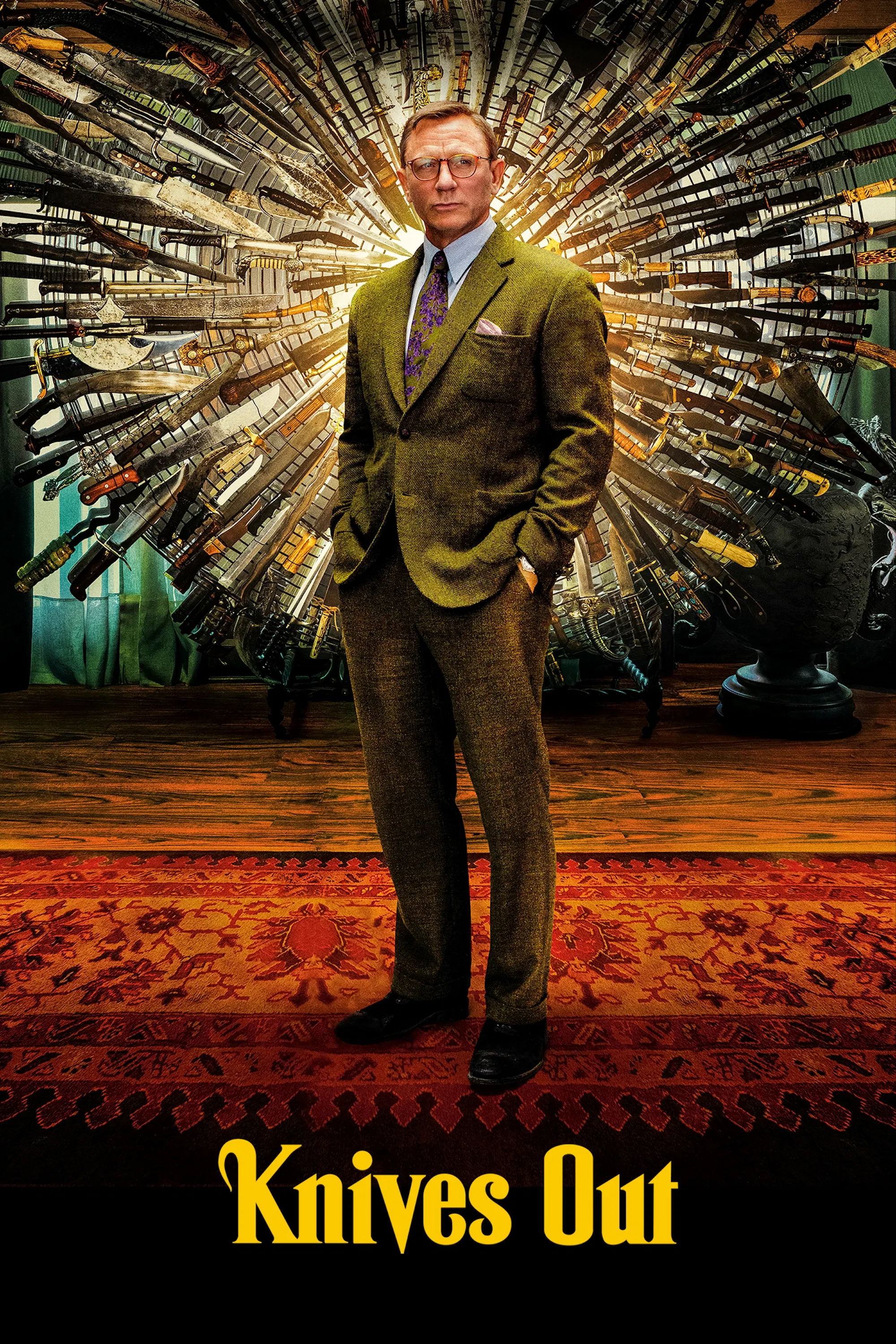
Knives Out Blu-ray collector's edition
Designs don't just sell movies; they speak in the same language as the film. The question is whether you listen.
Why the Steelbook Matters
Steelbooks are a collector's artifact: metal slipcases with glossy printing and often exclusive artwork. For studios and design houses they are high‑visibility micro-commissions—small, framed statements that sit in a fan's home long after the credits roll. Because steelbooks are produced in limited runs and targeted at a cinephile audience, designers can afford to be playful and cryptic in ways mainstream mass-market art cannot. That gives the steelbook a unique license to hide details meant to reward the observant.
The intentionality of special edition art
Great packaging does two things at once: it summarizes and it teases. Summaries lean on dominant motifs from the film—character faces, key props, palettes—while teasers hint at an additional layer: a symbol, a misplaced prop, a mirrored reflection. For Knives Out, a movie that explicitly invites the audience to play detective, the steelbook is an invitation in miniature. Wherever design teams have run out of space to explain a plot, they often hide a wink.
The Visual Language of Knives Out

Rian Johnson film director portrait
Rian Johnson’s film is rich in symbolic shorthand. Its sets, props and camera moves behave like clues in a board game: fingerprints, receipts, overlooked pills. The film trades in inversion, too—misdirection that misreads motive and flips sympathy. To read its packaging is to find those same modes of signification transposed to the two‑dimensional plane: scale, color, alignment, and absence become the film’s grammar.
Key motifs to watch for
- Knives and edges: Literal objects in the film and frequent graphic elements on promotional art—lines that point and create implied motion.
- Reflections and mirrors: Surfaces that divide or duplicate a face—classic devices for signaling duality or hidden truth.
- Negative space: What an image omits often matters as much as what it includes; gaps create arrows and frames.
- Color accents: A single color out of an otherwise muted palette becomes a visual exclamation point.
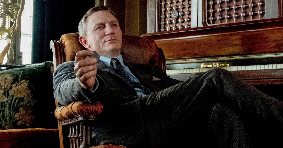
Close Reading: The Steelbook Cover

Knives Out steelbook cover art
Rather than treat the steelbook as mere merchandising, imagine it as a still image that must do two jobs—capture the film’s tone and reward an attentive eye. In the Knives Out steelbook, designers compress the movie’s chaos into a calm, ordered plane. When we unpack that compression, we find an arrangement of elements that echoes the film’s logic: who stands central, who is obscured, what objects are emphasized, and crucially, what is made to point somewhere else.
Composition and axis
Consider axis and balance. Designers who want to hint at hidden agency will often place a subtle visual axis—created by a knife’s blade, a sleeve, the direction of a gaze—that converges not on the apparent protagonist but on a marginal figure. It’s a classic cinematic cheat: force a line of attention to cross an object's threshold and the viewer reads causation into it. On the steelbook, a set of diagonal elements quietly create that axis.
Reflection and scale
Reflection—either literal mirror imagery or compositional mirroring—works like a whisper. On promotional art, small mirrored fragments can place an element back into the scene in miniature, as if to say: check again. Scale, meanwhile, calibrates importance. A slightly undersized face among larger ones suggests concealment or agency hiding in plain sight. In the Knives Out cover the interplay of scale is intentionally off‑center: one face shrinks, another is framed through a negative space cutout, and those small refuses reward inspection.
A tiny reflection can carry more narrative weight than a large portrait.
How to Spot the Murderer: A Step‑by‑Step Visual Method
Below is a practical framework you can use on any promotional piece—steelbook or poster—to interrogate whether the art is hinting at a hidden truth. Apply these steps slowly and deliberately; each step is cumulative.
1) Identify the dominant axis
Look for implied lines: the edge of a blade, the tilt of a head, or the fold of a coat. Trace those lines with your eyes. Do they point to or through a particular person? Designers rarely make these axes blunt; they nudge.
2) Scan for anomalies in scale and cropping
If a character is cropped oddly—half present, half off the edge—ask why. That dramatic cropping can mean the person acts in the margins of the story, manipulating events without owning center stage.
3) Find the single color accent
Designers often reserve one hue as a narrative signifier. It might be red for blood, blue for coldness, or yellow for duplicity. Follow that color: where else does it appear? Is it incidental, or does it punctuate a prop linked to motive?
4) Read reflections and mirrored surfaces
Small reflections—on glass, metal, or a polished instrument—can re‑place a figure into the composition. These micro‑images are the designer’s way of whispering that someone’s appearance doesn’t tell the whole story.
5) Consider negative space as a pointer
Negative space can form arrows, frames or cages. Sometimes an absence between two characters creates a crosshair aimed at a third. That silent geometry is a common, underused clue in visual art.
6) Cross‑check with props
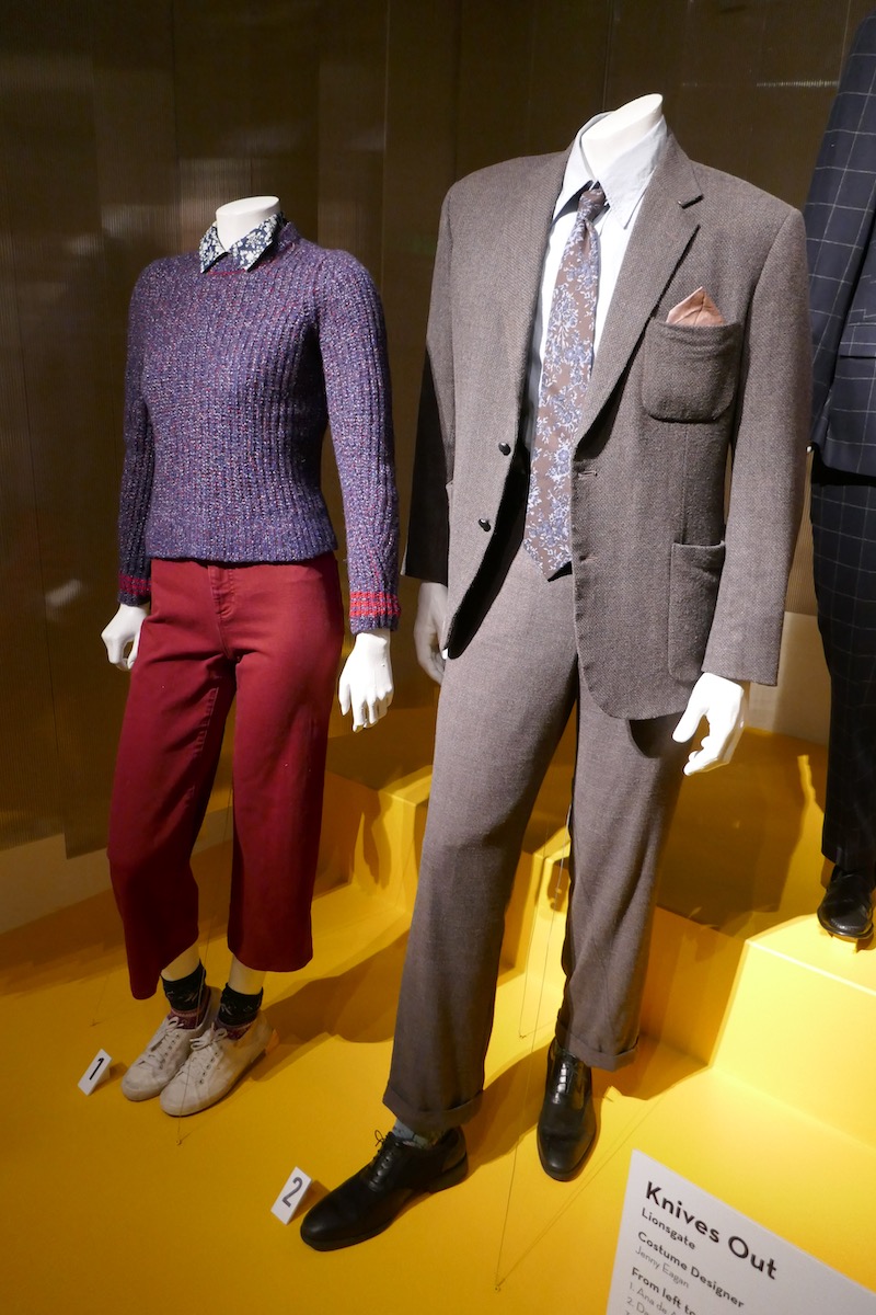
Knives Out movie props
Props repeat on both screen and cover. If a prop is given disproportionate prominence on the steelbook—an odd key, a cigarette, a bandage—treat it as a possible narrative signpost. Design choices that elevate ordinary items often point to plot usefulness.
Applying the Method: A Case Study
Take the steelbook and apply the six steps. First, identify axes. You will notice diagonals converging near a marginal figure—someone who, in the film itself, plays at being peripheral. Second, note any cropping that makes their profile slightly smaller. Third, locate the color accent; it may be a single warm tone that seems incongruous with the surrounding cool greys. Fourth, look for a reflection: a polished handle, a framed window or a mirror fragment. Fifth, watch the negative space where two larger figures stand; it forms an implied arrow that points through the gap to the smaller figure. Sixth, see whether a prop—perhaps a small medical object, a folded note, or even a ring—is highlighted.
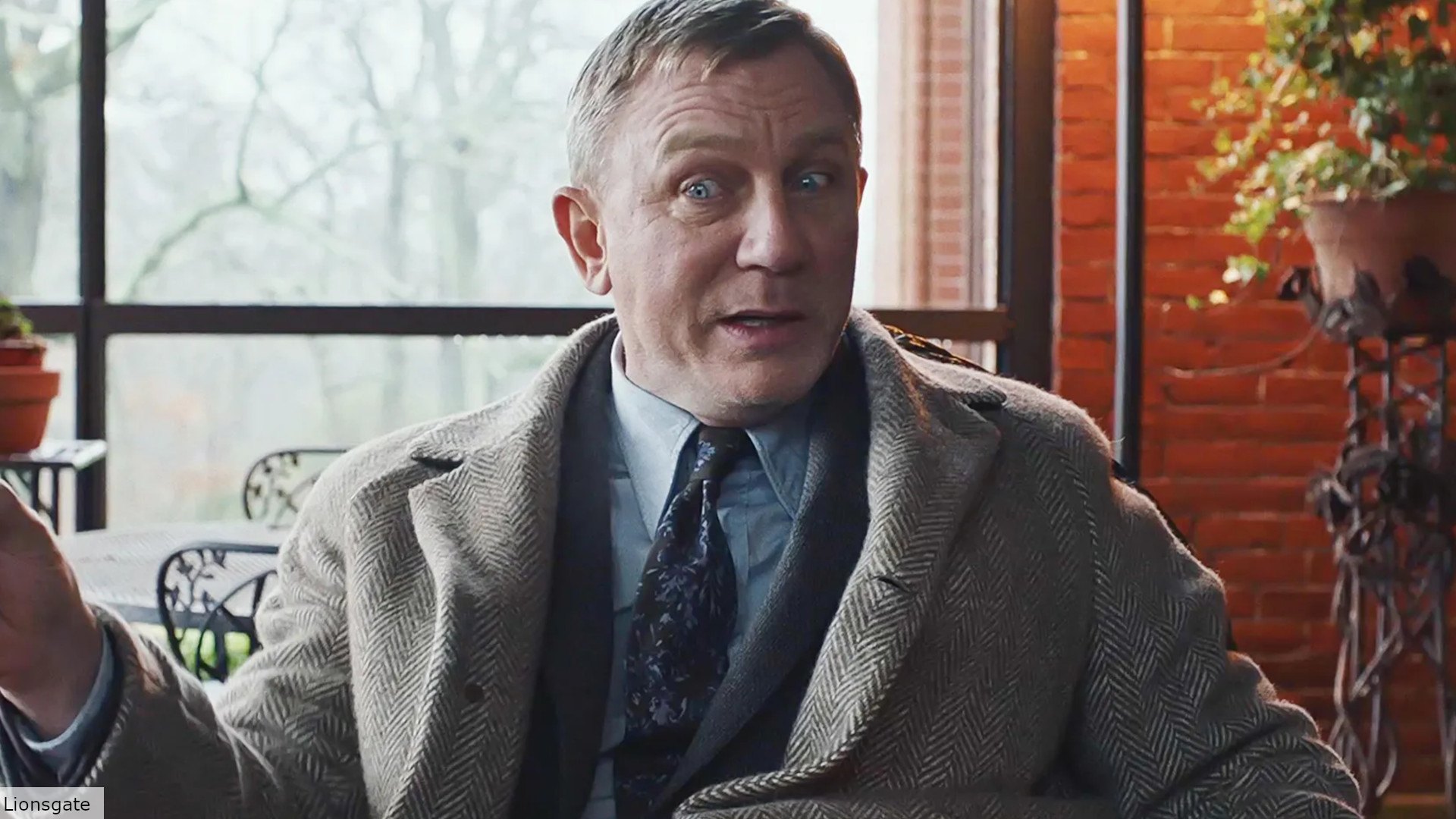
Daniel Craig detective character
Benoit Blanc character portrait

Chris Evans Knives Out character
When you synthesize those observations the steelbook stops feeling decorative and begins to read like an instruction: not exactly a reveal, but a confident hint that the person you were trained to ignore is, in fact, the engine of the plot.
Beyond One Cover: Why Designers Use These Tricks
There are three reasons design teams plant these kinds of clues. First, they reward dedicated viewers: the collector who buys the steelbook and studies it experiences an additional thrill of discovery. Second, they deepen the film’s ecosystem: the movie lives beyond the screen and invites a multi‑sensory conversation. Third, such clues generate social currency—online threads that dissect the art and spread word‑of‑mouth marketing without the studio lifting a finger.
The ethics of spoilers and design
There’s a playful tension here. A cover that hints at the murderer can be a spoiler in miniature. Designers balance that risk by making their clues subtle enough to reward those who look closely without handing away the ending to casual browsers. This measured ambiguity is precisely why the steelbook clue is so satisfying: it offers a lens, not a spoiler summary.
Common Objections and Counterpoints
Two common objections arise. The first is pareidolia—the human tendency to see meaningful patterns where none exist. It’s valid: not every coincidental angle is a clue. That’s why the method insists on multiple converging signals before concluding intent. The second objection is practical: art directors sometimes change multiple cover variants between regions and print runs. A clue appearing in one edition may be absent in another. That doesn't disprove intentional design; it simply means the hint was targeted at a particular audience—often the collectors who buy a premium edition.
Final Thoughts and What to Look For Next Time
Design is a language and the steelbook is a compact dialect. To read it is to add one more tool to your cinematic literacy: an ability to let the margins speak. Knives Out—the film—rewards that curiosity. Its steelbook does as well, if you know where to look. The clue isn't a shout; it's a gesture. It asks you to align your eye with the designer's and realize that sometimes, in mysteries, the loudest person in the room is not the one who moved the needle.
A good mystery invites you to become an investigator in life as well as plot.
- Look for converging signals: Axis, scale, color and reflections are more persuasive together than alone.
- Negative space is active: Gaps can act like arrows that point to motive.
- Props matter: Elevated objects on a cover often correspond to plot elements.
- Collectible editions are playful: Steelbooks are designed for the observant fan and may hide intentional hints.
Where to Practice
Try this method on other films with ensemble casts or layered mysteries. Poster art for classic whodunits, neo-noirs, and psychological thrillers is a rich proving ground. Observe, iterate, and compare editions. With practice your eye will catch the micro‑gestures that designers use to talk to us in code.
A closing invitation
If you love mysteries, don't treat the objects around a film as afterthoughts. Treat them as whispers. Open your next collector's edition slowly. Study the metal sheen, trace the axes, follow the color, and you may find that the story begins before the disc ever spins.