Portugal vs Spain: The True Geographic Size Explained
When you look at a printed map or a travel poster, Portugal often appears almost the same width as Spain — compact, neighborly, and tucked neatly along the western edge of the Iberian Peninsula. That visual similarity can mislead because maps, projections, and the eye play tricks on our sense of scale. This article peels back the layers: we’ll compare land areas, mainland versus total national area (including islands), population and density, topography and coastlines, and the map-projection distortions that feed the surprise. By the end you’ll have a clear, usable sense of how big Portugal really is compared to Spain and what that means in practical terms for travel, planning, and appreciation of geography.
A factual starting point: numbers and the simple ratio
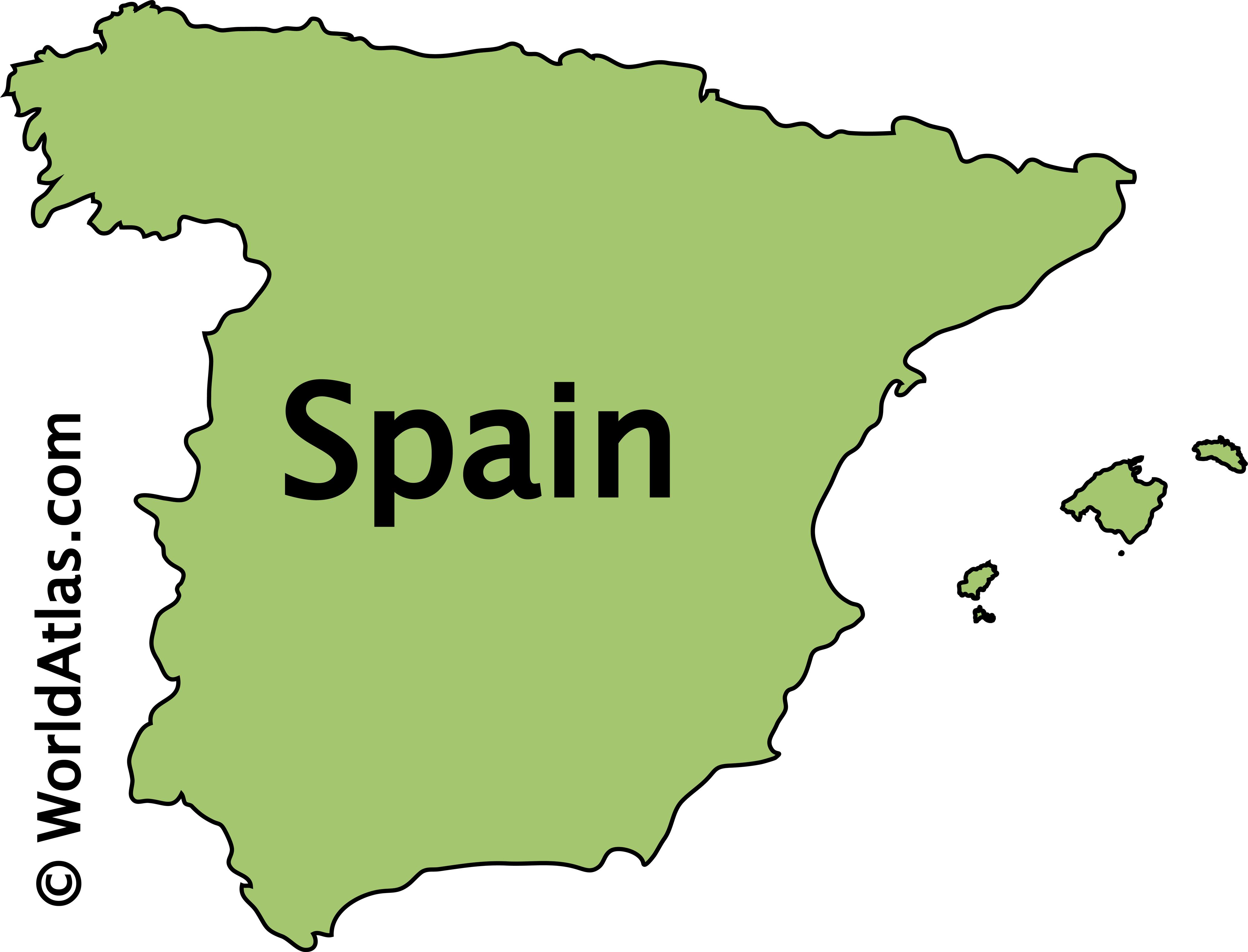
To anchor the discussion, start with the headline figures. Portugal’s total area — including its two autonomous archipelagos, the Azores and Madeira — is approximately 92,000 square kilometers. Spain, by contrast, covers roughly 506,000 square kilometers when including its island groups and overseas territories. Put bluntly, Spain is about five to six times larger than Portugal by area. If you focus only on continental, or mainland, territory the ratio changes only slightly: Spain’s mainland remains roughly five times the size of mainland Portugal.
Portugal land area 92000 sq km
Spain land area 506000 sq km
What those numbers do — and don’t — tell you
The raw area comparison is useful but limited. Area tells you how much surface each country covers, but it doesn’t directly tell you about population distribution, economic output, cultural variety, or travel time between cities. Portugal’s compactness produces advantages: shorter driving distances between northern mountains and southern beaches, quicker regional diffusion of ideas, and a concentrated infrastructure that benefits tourism. Spain, with its vast interior and multiple distinct regions, offers greater environmental and cultural variety simply because it spans a larger territory.
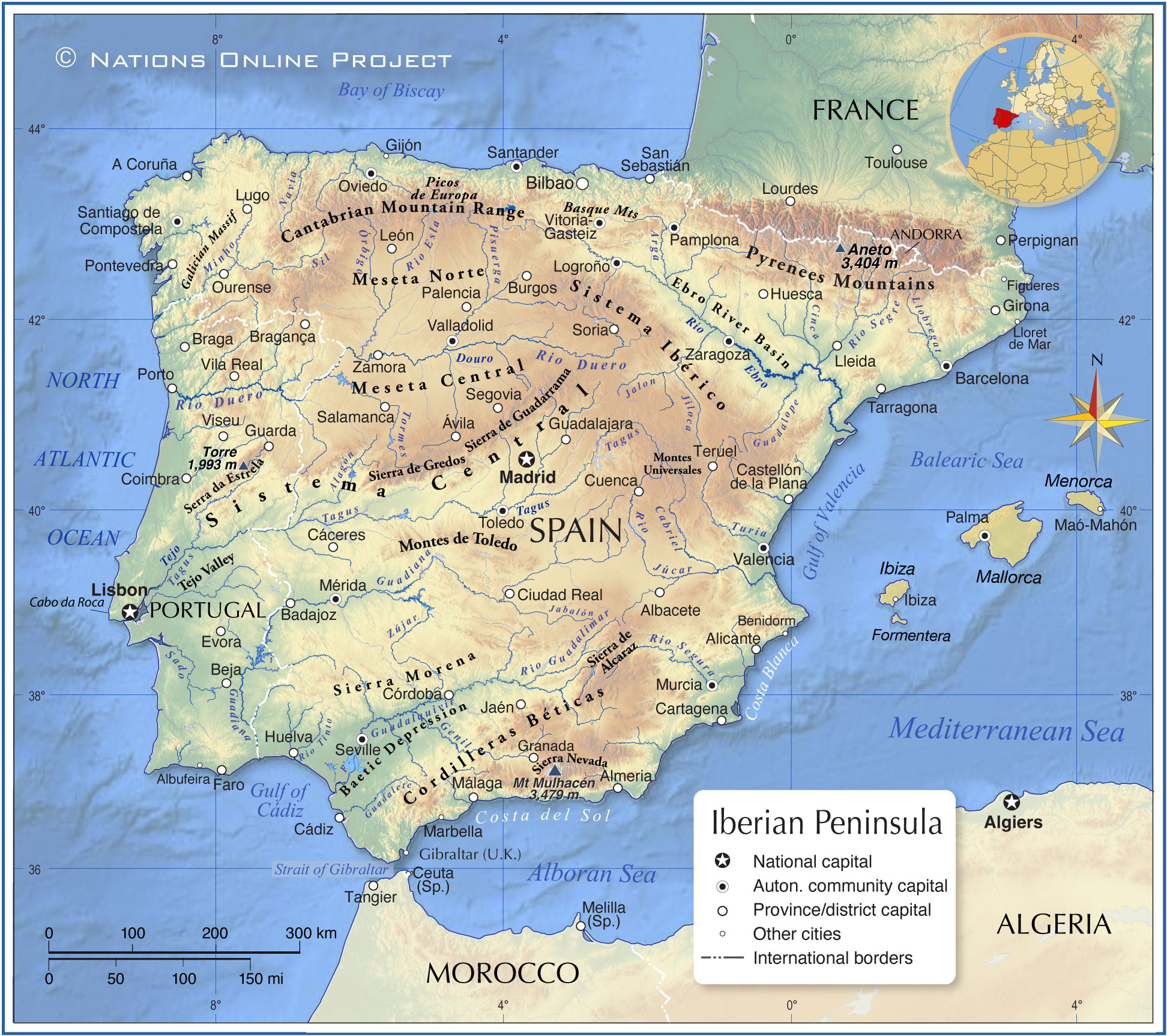
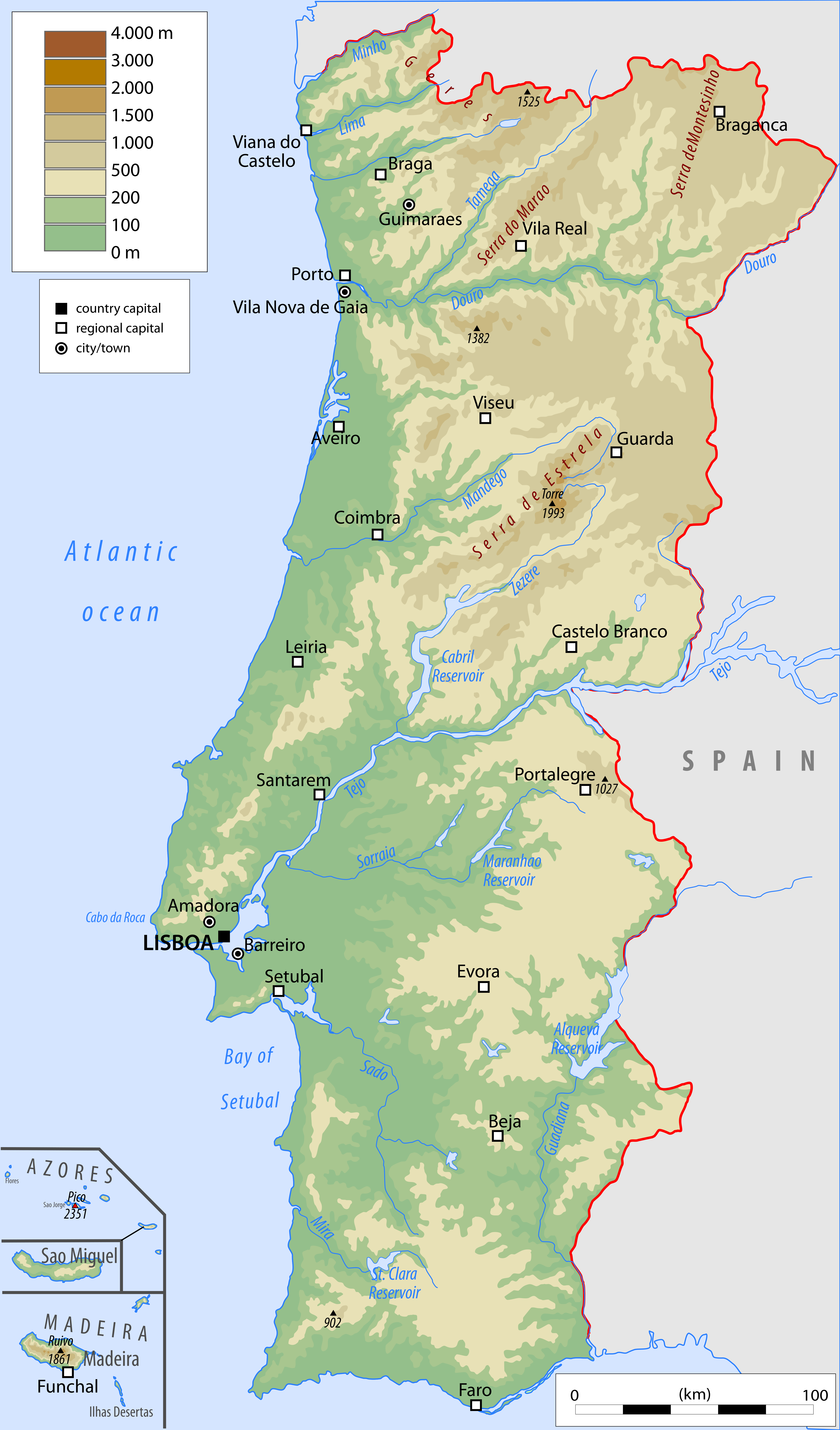
Iberian Peninsula geography
Why people underestimate Portugal’s smallness: perception and projection
One of the central reasons people misjudge Portugal’s size is the way maps are drawn and reproduced. The common Mercator projection, used for centuries in classrooms and online maps, preserves local shape but distorts sizes, especially as you move away from the equator. While continental Iberia sits at mid-latitudes and doesn't suffer the extreme exaggeration seen near the poles, the Mercator and other planar projections still create subtle distortions that can make Spain and Portugal look more similar in scale than they are.
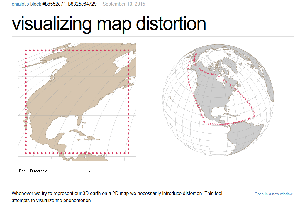
Mercator map projection distortion
Map projections in plain language
Different map projections prioritize different properties: area-preserving projections show relative sizes accurately but distort shape; conformal projections preserve local shape at the expense of area. When visual familiarity is built on a projection that doesn’t preserve area, human intuition about “how big” can be off. To get an accurate visual sense, area-equalizing projections — or interactive digital tools that allow you to overlay one country footprint over another at the same latitude — are the best options.
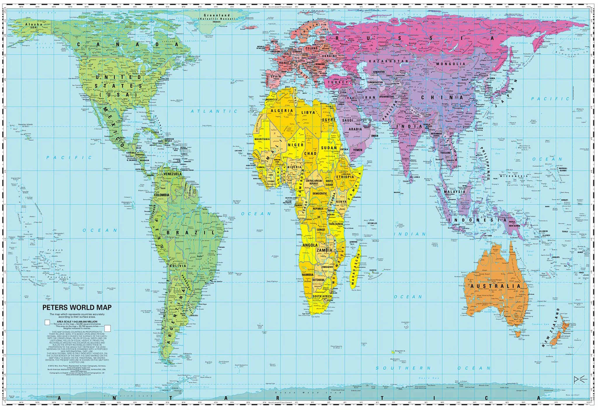
Gall-Peters equal area projection
Seeing Spain overlaid on Portugal makes the proportional difference undeniable: Spain spans miles of interior plains and multiple climatic zones; Portugal packs diversity into a much smaller footprint.