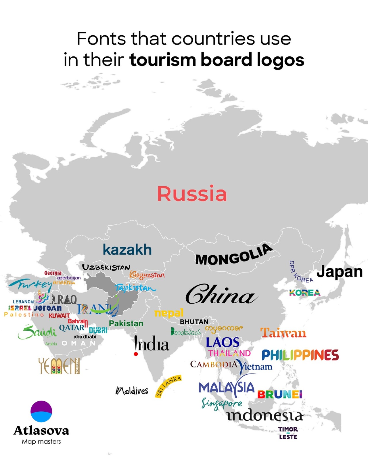
Fonts Used in Asian Tourism Board Logos
When a small cluster of letters becomes the emotional doorway to a country, the choice of font matters. In Asia — a continent of linguistic richness and visual history — tourism boards use typography to perform several jobs at once: be legible across languages, nod to cultural heritage, sit confidently in global marketing campaigns, and express distinct personality. This article unpacks the typographic strategies behind Asian tourism logos, exploring regional trends, script-sensitive choices, and the design lessons travel marketers can apply when a nation's name needs to do far more than simply be read.
Why Fonts Matter for Tourism Branding
Typography is more than decoration: it is a vehicle for meaning. For tourism boards trying to attract visitors, fonts must balance practicality with emotion. Practically, logos appear on physical signage, digital adverts, mobile apps, and tiny social media avatars; a type system that performs well at many scales is essential. Emotionally, a typeface conveys warmth, sophistication, adventure, tradition, or modernity — and does so before a single photograph or tagline is processed by the viewer.
In multilingual contexts common across Asia, typography also has to solve complex technical problems. Designers often pair Latin alphabets with local scripts (Devanagari, Hangul, Arabic, Thai, Chinese characters), and the typographic voice must remain coherent and respectful while functioning across writing systems. Because of that, many national tourism identities lean on custom lettering or bespoke type families that harmonize the different scripts.
The Roles Fonts Play in Tourism Logos
At least four distinct roles drive font choices in tourism identity work. First, readability — the font must be legible at a glance. Second, distinctiveness — the type should set the brand apart from competitors and regional peers. Third, cultural resonance — letterforms often reference calligraphic traditions, vernacular signage, or historical scripts to create an emotional anchor. Fourth, flexibility — the type needs to perform across print, web, motion, and wayfinding applications.
Type choices in tourism logos are a balancing act between global legibility and local authenticity.
Regional Typographic Trends Across Asia
East Asia: Minimalism, Precision, and Geometry
East Asian tourism identities — particularly in places like Japan, South Korea, Taiwan, and parts of China — often favor clean, modern sans-serifs for Latin wordmarks paired thoughtfully with local scripts. The aesthetics tend toward precision and restraint: narrow counters, consistent stroke widths, and generous spacing create a sense of calm confidence. When local scripts are used prominently, calligraphic or geometric interpretations of characters can provide a bridge between tradition and modernity. Designers in this region frequently commission custom logotypes that translate the brand’s tone across scripts while maintaining structural harmony.
Korea tourism logo typography
Southeast Asia: Warmth, Playfulness, and Handcrafted Feel
Southeast Asian tourism boards often emphasize warmth and hospitality through more expressive typography. In nations with strong tourism-driven identities — such as Thailand, Indonesia, and the Philippines — designers might use soft-rounded sans-serifs, friendly display scripts, or handcrafted letterforms that hint at local craft and oral traditions. Decorative motifs and subtle script flourishes suggest movement and festivity, which dovetail with the region’s strengths in food, festivals, and coastal tourism. Legibility is still essential, but there’s more room for personality and regional ornamentation in the type treatment.
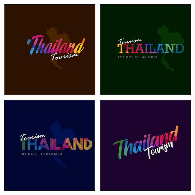
Thailand tourism logo typography
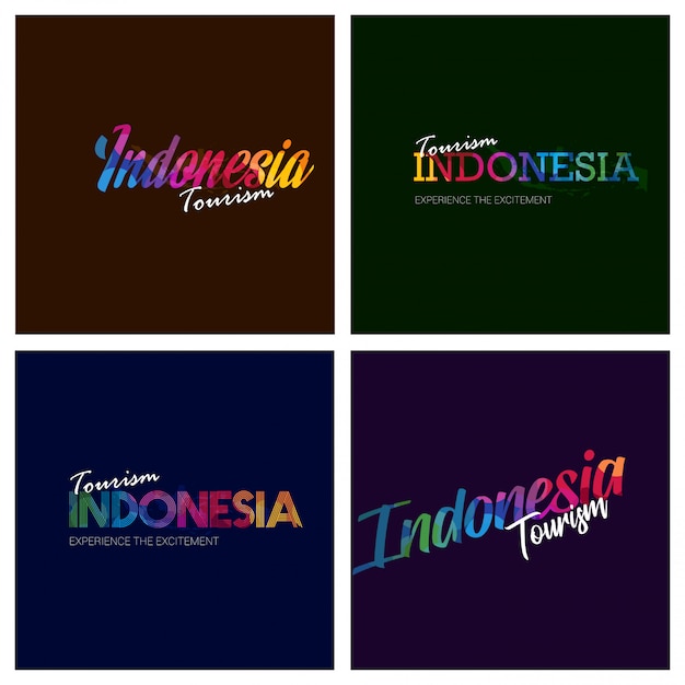
Indonesia tourism logo typography
South Asia: Script Sensitivity and Multilingual Balancing
In South Asia, where Devanagari, Tamil, Bengali, and other scripts exist alongside Latin alphabets, typography must negotiate linguistic pride and international clarity. Tourism logos from India, Nepal, Sri Lanka, and neighboring countries often pair a strong Latin type with a local-script companion that is either traditional in form or consciously modernized to match the Latin weight. The choice between a faithful traditional letterform and a contemporary reinterpretation depends on whether the brand leans into heritage tourism or positions itself as a modern destination for business and leisure.
West Asia and Central Asia: Calligraphy, Formality, and Monumentality
Across West Asia (the Middle East) and Central Asia, Arabic and Turkic scripts bring a rich history of calligraphy and ornamental forms. Tourism logos here often utilize elegant Arabic calligraphic styles or adapted Latin fonts that reflect the same proportions and rhythm. The effect is typically formal and monumental — a fit for destinations that emphasize historical architecture, pilgrimage routes, or cultural heritage. At the same time, younger tourism identities in the region are experimenting with geometric sans-serifs and minimal wordmarks to attract contemporary travelers and digital-first audiences.
Common Typeface Styles and Their Effects
Sans-Serifs: Modern, Clean, Universal
Sans-serif families are the workhorses of tourism branding. Their simple strokes read well at small sizes and reproduce cleanly in digital channels. A geometric sans emphasizes modernity and order; a humanist sans adds warmth and accessibility. Tourism boards aiming for an international, business-friendly image often prefer sans-serif wordmarks with clear letter spacing and open counters.
Serifs: Authority and Tradition
Serif typefaces — especially those with classical proportions — are less common but used strategically to communicate history, gravitas, and cultural continuity. For heritage-heavy tourism narratives, a well-chosen serif in a logo or tagline can add an impression of cultural depth without sacrificing readability, provided the type is optimized for small sizes and multiple scripts.
Display and Script Fonts: Personality and Storytelling
Display and script faces provide strong emotional cues. Script-inspired logotypes evoke craft, local lettering traditions, and hospitality; display faces can suggest exoticism or festival energy. Because display choices risk legibility problems, they are often paired with neutral sans type for body copy and supporting messaging.
Case Studies and Practical Examples
Japan: Minimalism with Cultural Nuance
Japanese tourism visual systems typically aim for a balance between sleek modernity and subtle cultural references. Latin wordmarks are often minimal, while Japanese characters either appear in simplified modern forms or in stylized kanji that reference brushstroke motion. This pairing creates a brand that feels both globally refined and locally rooted.
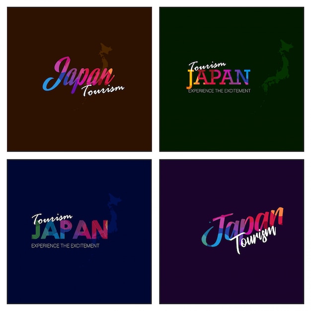
Japan tourism logo typography
Thailand and Indonesia: Expressive Lettering
Thailand and Indonesia frequently use more expressive typography that hints at script heritage and local arts. Curved terminals, soft glyph shapes, and occasional ornamental ligatures give the logos a handcrafted warmth. These choices align with tourism promises of hospitality, festivals, and culinary richness.
India: Multiscript Strategy
India’s tourism branding must engage with many scripts and linguistic identities. Successful typographic systems here rely on careful pairing, where a primary Latin type is backed by tailored Devanagari or regional script treatments. Designers often create parallel typographic hierarchies so signage and advertising feel cohesive whether a viewer reads English, Hindi, Tamil, or another language.
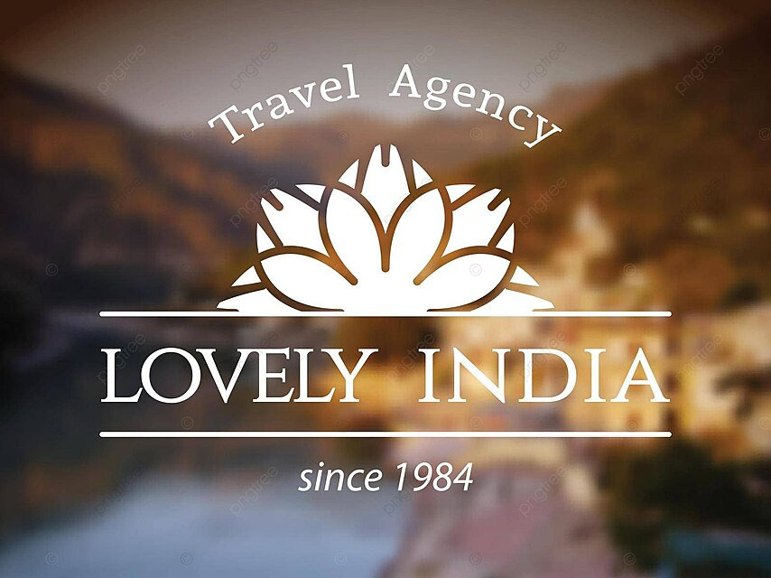
India tourism logo typography
United Arab Emirates and Gulf States: Luxurious Script and Geometric Modernity
Several Gulf tourism identities blend elegant Arabic calligraphy with confident Latin sans-serifs. The result underscores luxury, investment in infrastructure, and curated cultural experiences. For international audiences, the Latin type carries the immediate message, while Arabic scripts affirm authenticity and local leadership.

UAE tourism logo typography
Design Principles for Multilingual Tourism Logos
1. Prioritize Legibility Across Scales
Legibility is non-negotiable. Test wordmarks at digital avatar sizes, on large-format signage, and on vehicle liveries. Consider x-height, counter size, and stroke contrast when pairing scripts with differing optical sizes.
2. Respect Script Proportions and Calligraphic Rhythms
Different scripts carry different visual rhythms. A Latin type with uniform stroke widths may feel at odds with a cursive Arabic or flowing Devanagari unless the pair is intentionally harmonized. Designers should study calligraphic traditions to avoid visual dissonance and to show cultural literacy through respectful typographic decisions.
3. Use Custom Lettering Wisely
Custom logotypes can solve many cross-script issues, but they demand investment. Bespoke lettering ensures unique brand recognition and allows deliberate matching between scripts; however, it should be accompanied by a flexible type system for body copy and campaign materials to maintain consistency.
4. Consider Practical Constraints
Licensing, web performance, localization workflows, and accessibility requirements shape type choices. System fonts may lower costs but risk appearing generic; web fonts improve digital control but add loading considerations. Always map the technical constraints early in the branding process.
Testing and Governance: Keeping Typography Consistent
Typography governance is crucial for national brands used by many stakeholders. A robust brand guideline will include approved fonts, usage rules, minimum sizes, color combinations, and examples of correct multiscript pairings. Governance also clarifies when alternative scripts may appear and whether local-language lockups are permitted for regional campaigns. Without these guardrails, a tourism identity can splinter across platforms, diluting recognition.
Good typographic governance keeps a country's visual identity coherent whether printed on a brochure or cut into a metal welcome sign.
What Emerging Trends Mean for the Future
Several trends are shaping how tourism boards will use type over the next decade. First, variable fonts and responsive typography let designers tune weight, width, and optical size dynamically — a boon for cross-platform consistency. Second, an emphasis on sustainability and local storytelling encourages logotypes that reference traditional crafts and vernacular letterforms. Third, younger destinations are choosing minimalist, digital-first wordmarks to appeal to remote workers and experience-driven travelers. Collectively, these trends point to more nuanced, adaptable typographic systems that remain culturally grounded.
Conclusion: Typography as a Strategic Tool
Typography in Asian tourism logos is an exercise in storytelling under constraint. It asks designers to be typographic diplomats — translating culture into shapes that must be read, felt, and trusted by global audiences. The strongest tourism identities arise when technical excellence (readability, scalability, governance) meets cultural sensitivity (script respect, local motifs, narrative coherence). For practitioners and marketers, the takeaway is clear: invest early in type strategy, test across languages, and treat lettering as the ambassador it is.
- Legibility first: test type across scales and languages.
- Respect scripts: harmonize Latin and local writing systems thoughtfully.
- Governance matters: provide clear guidelines and modular assets.
- Invest in custom work: bespoke lettering pays off for authenticity and cross-script unity.
This feature synthesizes typographic patterns across Asian tourism identities and offers practical guidance for designers and marketers planning national or regional campaigns.